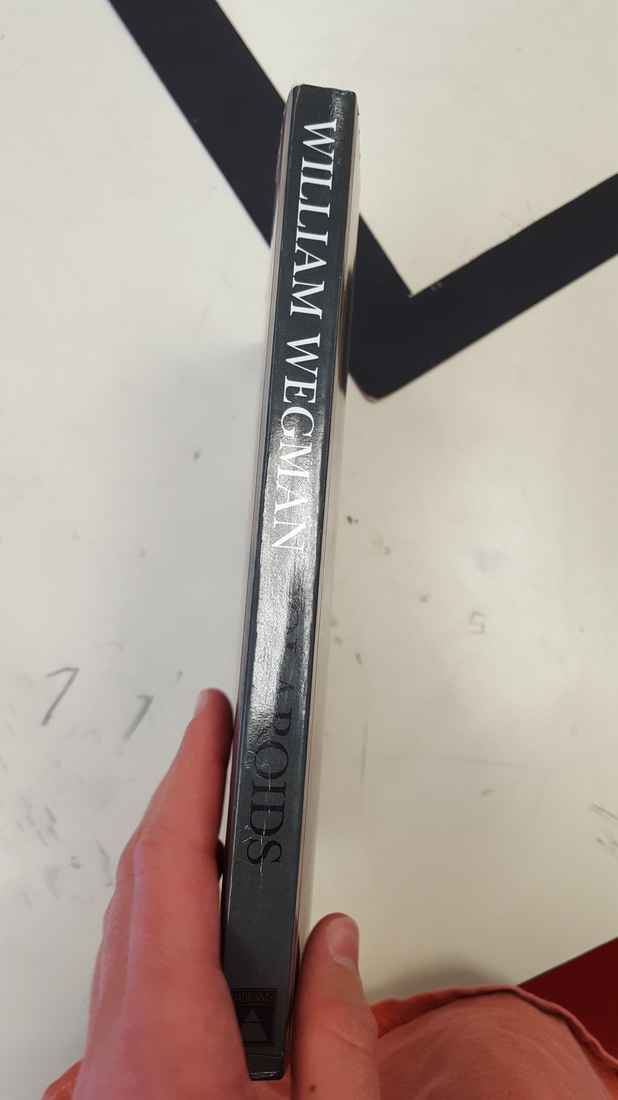
There were a few photos that inspired me to take this on. First, I found this book by William Wegman where I saw how he basically covered a background in a sheet to create a set, and used odd props and subjects to create really interesting and thought-provoking photos. I also found another picture of a dog on your website which was similar and I wanted to make something like it.
20 New Photos
4 Edited Photos
Printed/Matted Photo
5-Step Critique
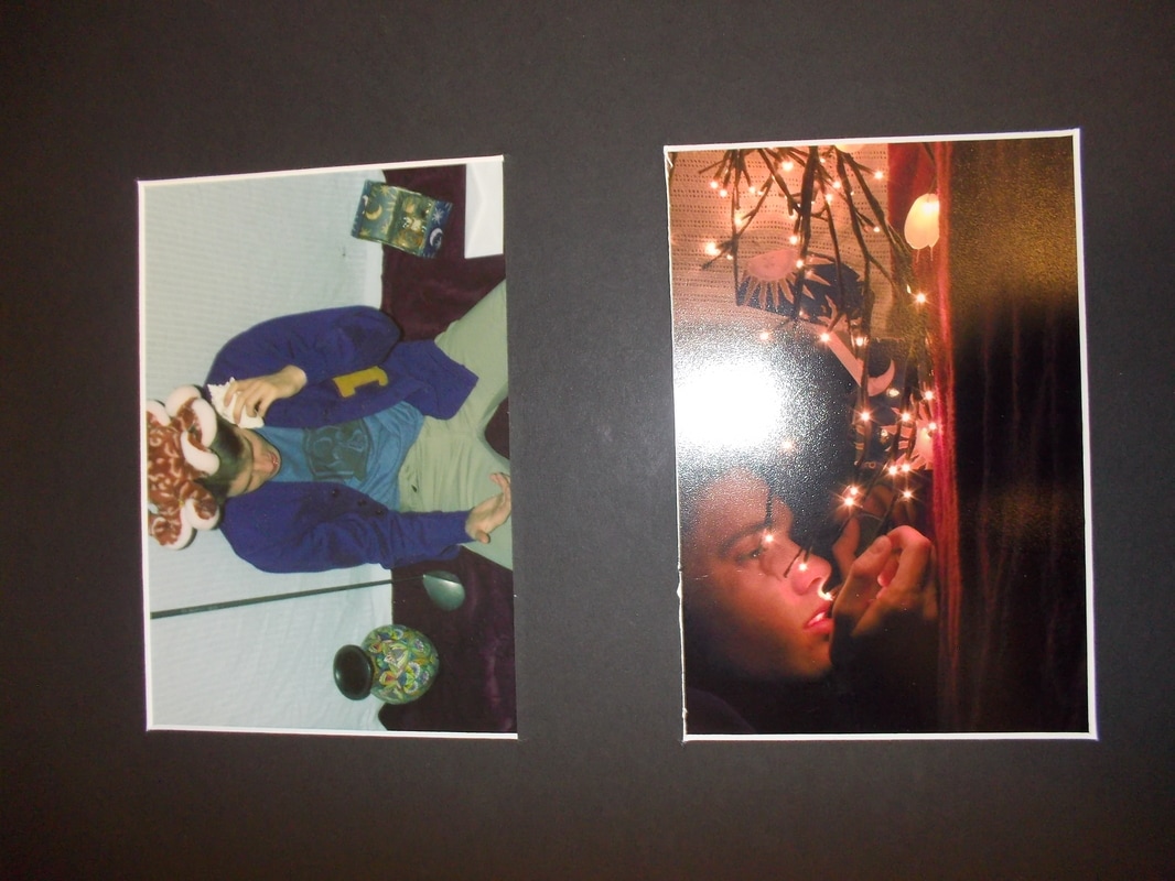
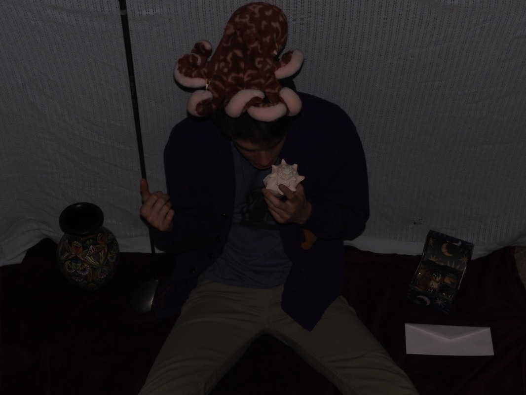
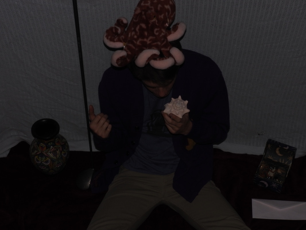
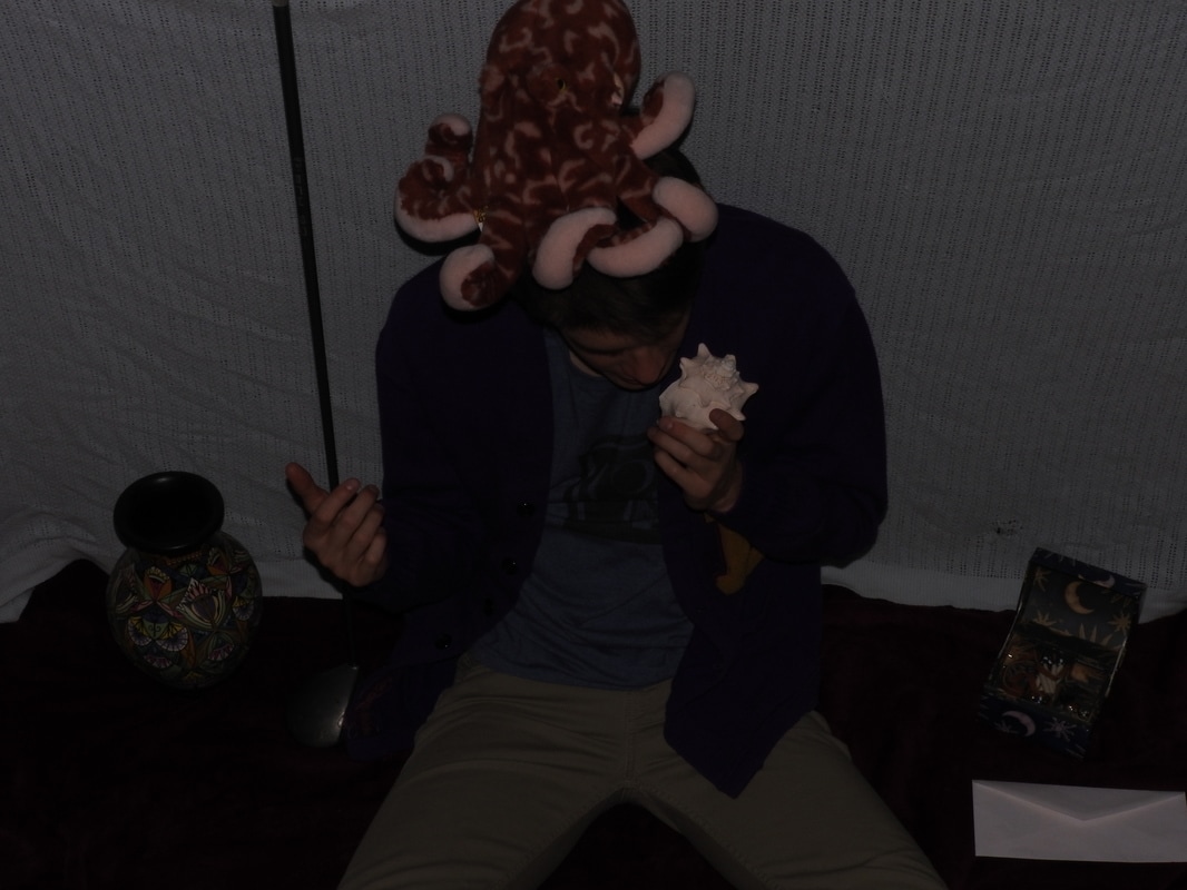
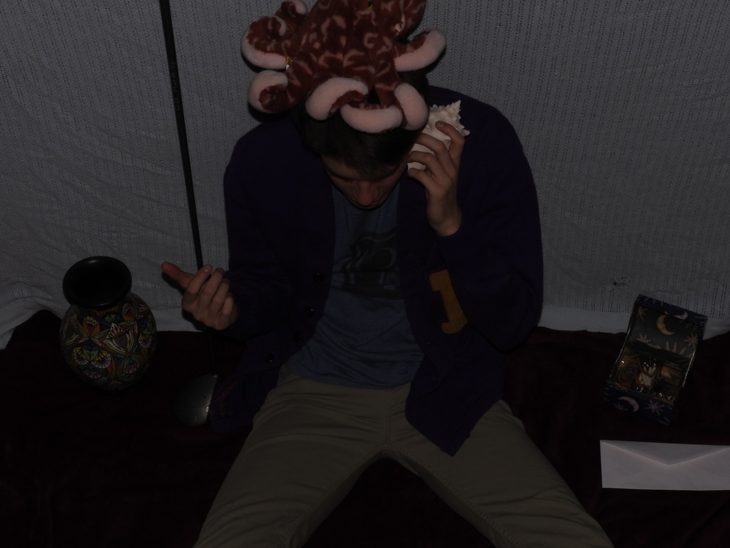
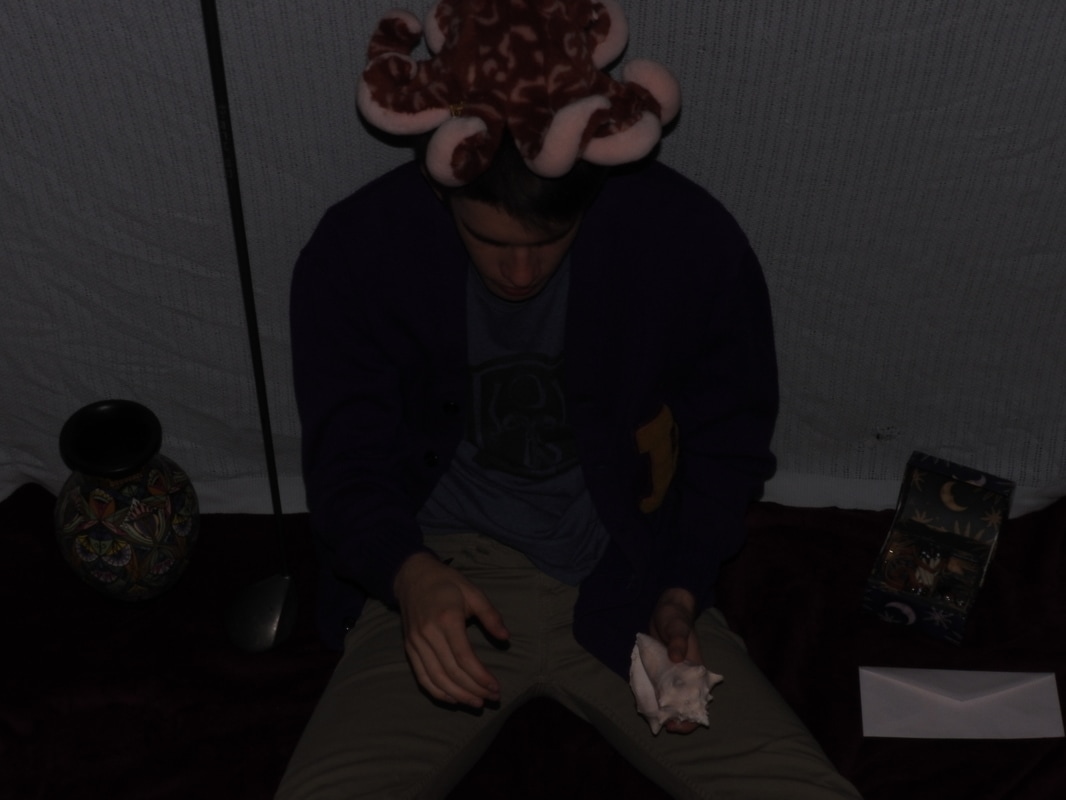
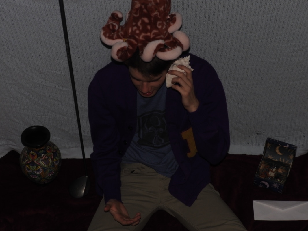
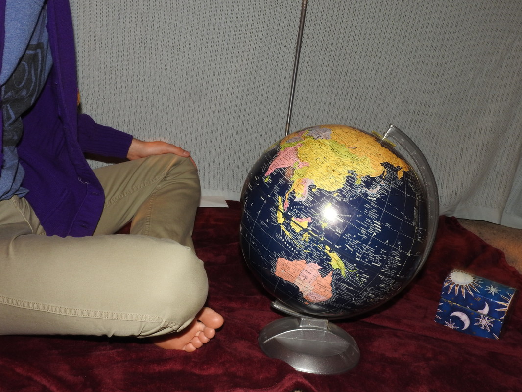
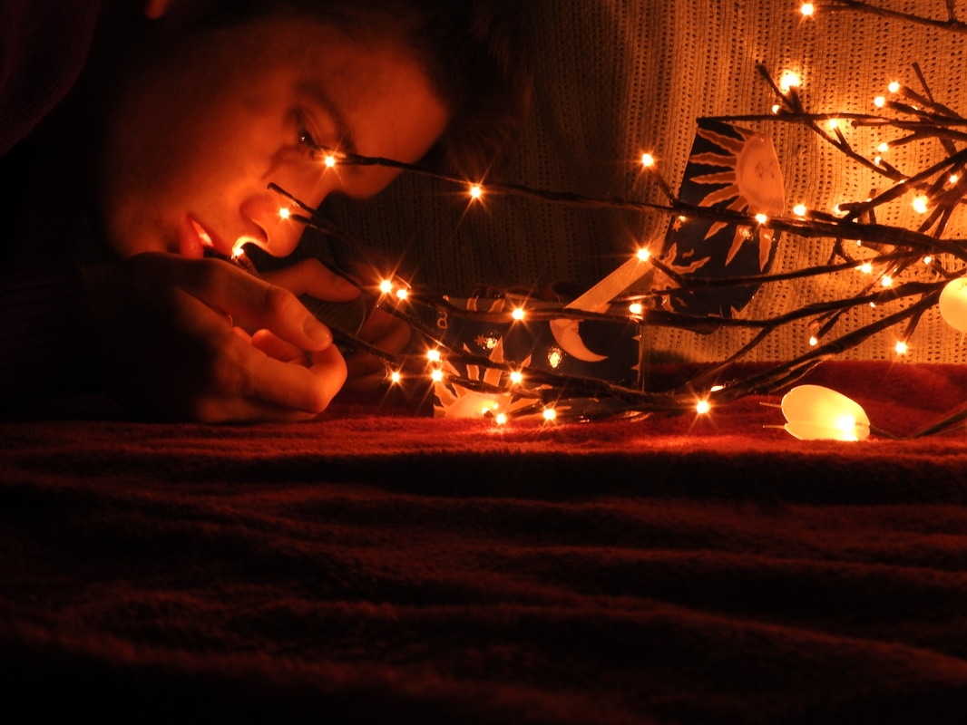
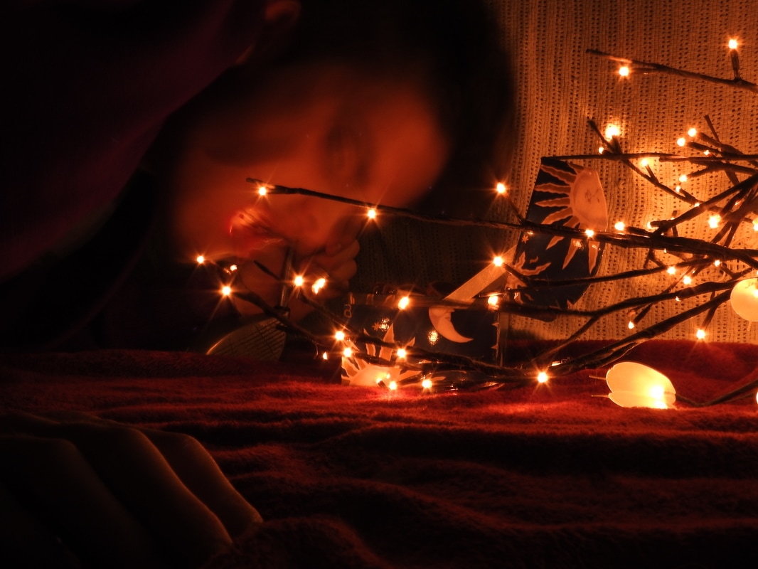
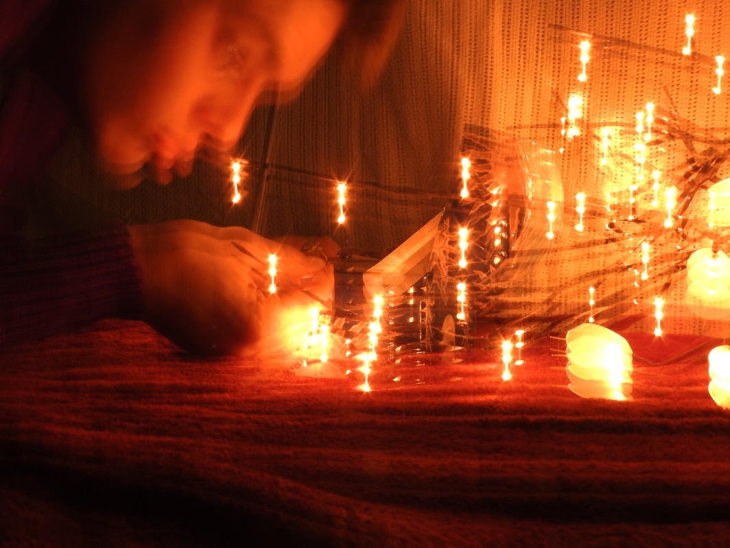
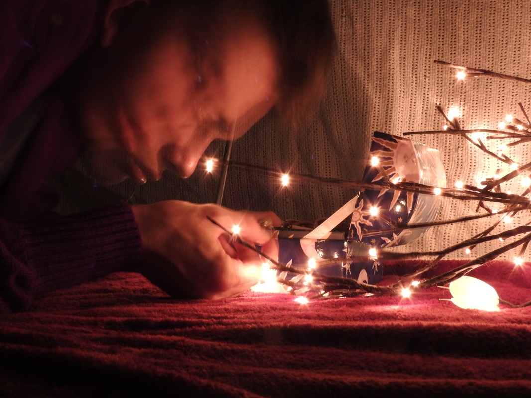
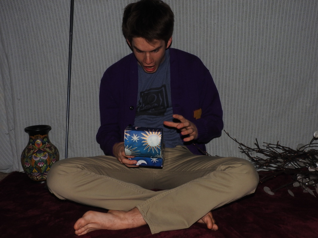
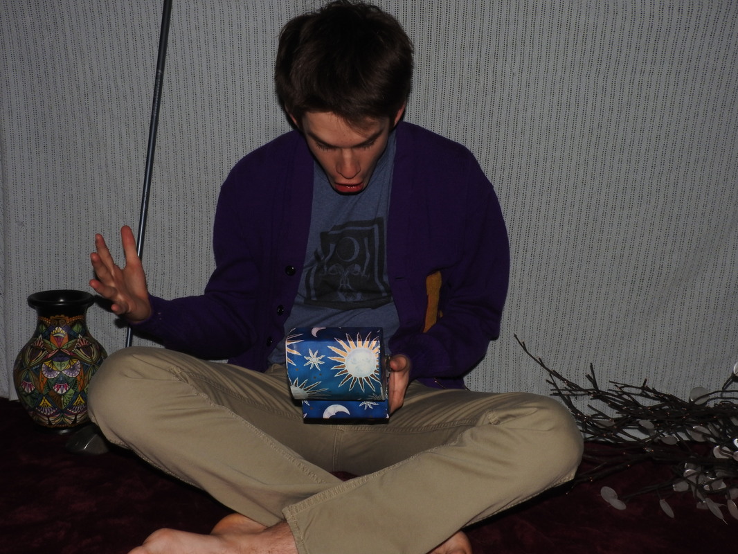
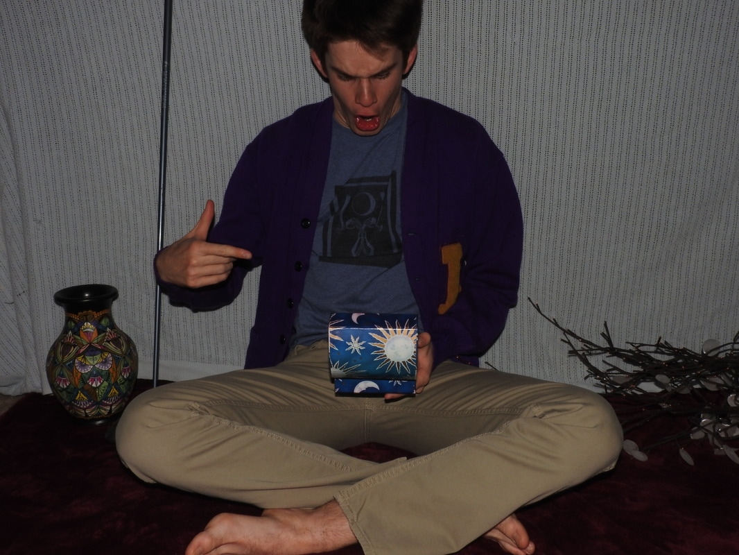
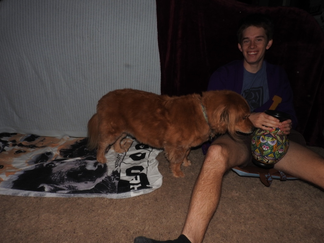
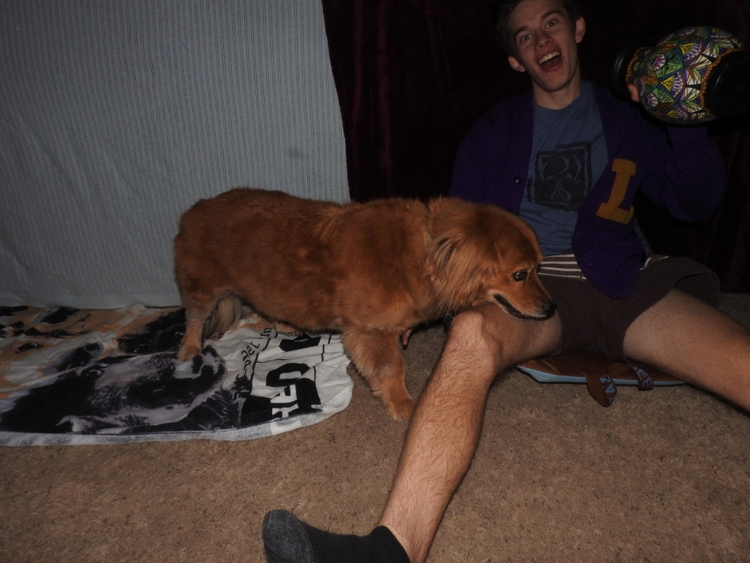
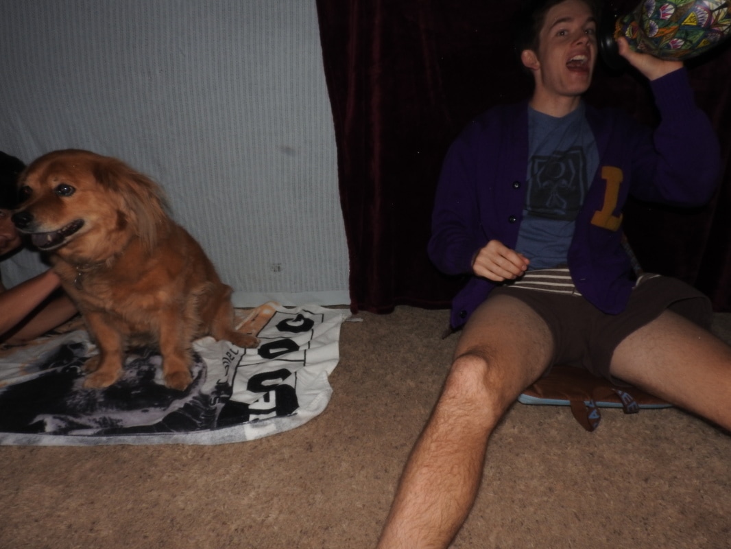
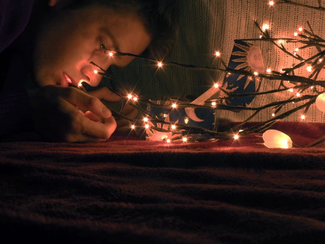
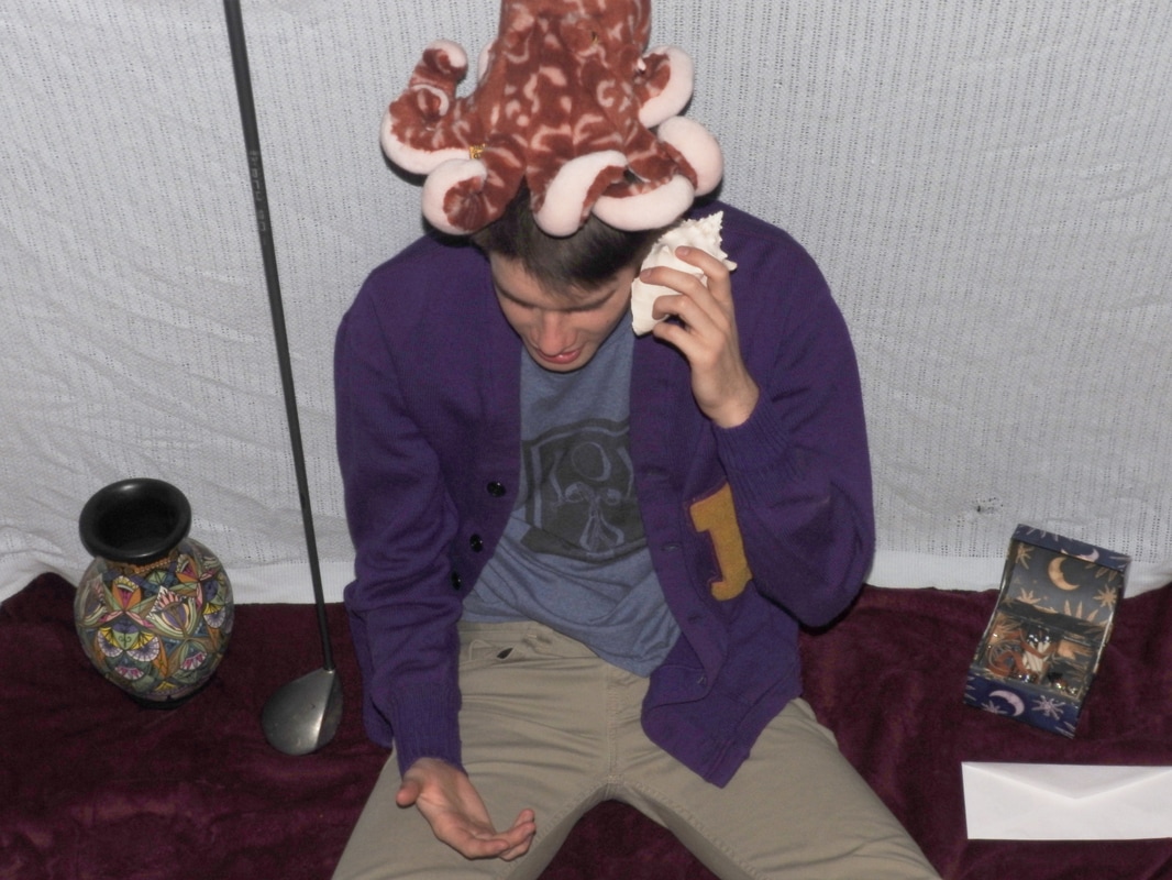
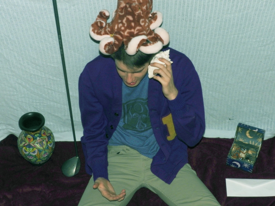
1. See Above 2. In the first top photo, my brother is sitting down with a stuffed animal octopus on his head and a shell in his hand, held up next to his ear. He is gesturing to make it look like he is talking to the shell like a phone. On the far left, there is a colorful vase and a little closer to him is a propped up golf club. On the right is a small box with pictures of the moon and sun on it. There is an envelope under that and the photo has a blueish hue. Behind and under everything are two blankets. In the bottom photo, there are folds of a blanket leading to my brother's face in the foreground, which is partly in shadow. He is looking into the opened moon box. Coming from the right side and pushing towards his face and in front of the box are lights which are made to look like they are on branches. It has an orange hue. I used the back of my couch, blankets, and a slightly long exposure for the bottom photo for the end work. 3. I believe that these photos emphasized the element of art space particularly well. In the first photo, the space is somewhat confusing, as it is taken from a top angle, the flash takes away shadows, and the only background is two blankets. It's hard to tell how much space there is, which makes it really interesting. Then, the second one is taken very close up, which contrasts the first photo and creates a small space. This brings the subject right up close and makes the photo interesting. The set of photos use the principle of design balance the best because they contrast. One is blueish and one is orangeish, one is farther away and one is close up, and one is complex and the other is simple. These contrasts aren't so different that they break the unity, so that they create a balance of emotions. Also, the element of art space informs the principle of design perspective by showing what perspective the photo is taken from. 4. This photo gives the viewer a feeling of wonder and create a dream-like thought. They both have odd and random props, which are taken out of perspective by the simple background, to create a whimsical world. These photos spark creative and curious thinking. I also think these photos seem to tell a story of someone going on a beautiful story, through the progression of them and the wonder involved. 5. This work to me is very successful because it conveys the feeling I wanted very well through the props and colors. However, I feel like all of my photos never hit viewers hard. I would like to do something that make people say "wow," not "I like how it looks." The overall quality of my work is quite good in terms of photo taking and editing even though I was rushed to take the photo. But, my matting wasn't great. I would definitely hang it in my home and I think it would be fit for the right gallery with some more precise photography and matting.