9x12 Value
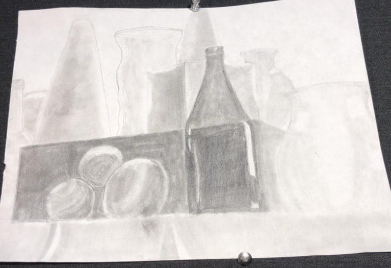
The task for the still life was to capture shapes with the most accurate depiction of their shadows. We were mainly working on developing our shading skills, or adding value to drawings. We used our whole range of pencils to capture these objects from whatever perspective we were sitting in-- for me it was slightly under the objects.
The element of art we were working to develop the most was value, which influenced contrast by adding darker and lighter parts of the image, which contrasted each other. The bottle in the front has very dark values, which contrasts the much lighter values in the back. This is important because we were trying to depict each subtlety of value in this image.
This piece doesn't have much story or message, but it's main purpose was to show the most accurate depiction of shadows on a collection of objects. It also has a slightly melancholy mood.
I think I was very successful in using the whole range of pencils to create a piece with lots of variety in shades of gray, which helped me to shade well. The objects in the back of this image look pretty realistic and well shaded. However, I think the bottle, box, and balls in the front could have been more acutely refined. They seem too dark and the shading on them is very harsh. I somewhat enjoyed making this image, but it was difficult trying to smoothly change the value of objects and make them look realistic, and because of this difficulty I'm not extremely happy with the outcome, but I think it went pretty well overall.
